We have discussed Exploratory Data Analysis, known as EDA & have also seen few powerful libraries that we can use extensively for EDA. EDA is a key step in Machine Learning, as it provides the start point for our Machine Learning task.
But, there are a lot of issues related to traditional Data Analysis techniques. There are too many new libraries coming up in the market to rectify these issues. One such API is AutoViz, which provides Quick and Easy visualization with some insights about the data.
Introduction
AutoViz is a short term for Automated Visualization. Term Automated implies it can automatically select the best features in the dataset and present some powerful visuals. The main advantage of using this library is that we don't have to write down tens of thousands of line code to get the insights, contrary we can use just a line of code to get all the EDA work done for us.
AutoViz can be used together with JSON, CSV or TXT files & with any of the data contexts like regression, classification, or even time-series data.
Another thing that impressed us about this library was its speed delivering output incredibly fast this is possible due to a great feature of this library that Automatically samples the data randomly if the dataset is large.
So, what are we waiting for let us begin by installing the library.
Installation
We will be using Jupyter notebook for the entire purpose you; may use any other IDE of your choice also.
## conda installation
conda install autoviz
## pip installation
pip install autoviz
## Jupyter Notebook installation
pip install autoviz
Let's grab a coffee by the time it gets installed.
Once the library is installed, we might be asked to restart the kernel(in the case of Jupyter Notebook) to reflect the changes.
Great we have installed our AutoViz library. And good to go with some examples which will help us understand it better.
Getting Started
*Please Note:- We prefer using Titanic Dataset as our first dataset for analysis.
Importing the dataset
 |
| Importing Dataset |
Generating the Visuals
 |
| Generating Visual |
Analyzing the Reports
Here comes the most crucial section of the article, Analyzing the report.
The very first line we can see in the report is "Shape" of the dataset remember using the df.shape() command for this.
Further down, we can see a list of variables classified according to their data. (Shown below)
Further down, we have graphs providing different insights about our data.
First is the Pair-wise Scatter plot of all the continuous variables. (Fare & Age in our case)
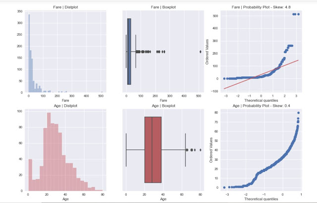
Followed by Distplot, BoxPlot and Probability plot of the variables.
The next graph that we like to mention here is the HeatMap it is particularly important to visualize the correlation between the variables in the dataset.
Post this we have bar charts with an average value of Age & Fare variable for other variables.
Those were all the insights that AutoViz has to offer us.
Summary
We tried to understand the basics of a new library for EDA., How to install & Use it. Compared to other Python libraries used for EDA, Autoviz stands low, as we can get a lot more insights and visuals with other similar libraries.
Till then, What are you waiting for go, ahead download it and start playing with it, and share your views, issues and suggestions.
That's all from here. Until then, This is the Quick DataScience Team providing a Quick and Easy guide/insight of another DataScience topic.


Comments
Post a Comment