Welcome to the First Post in the series of Data Visualization, of one of the best time passes and Entertainment for people around the globe — Netflix.
We will be going through the dataset and having an overview of the content present on Netflix.
Let’s have an overview of the dataset.
 |
| Description of columns of Netflix Dataset |
Moving on.. and giving a look at the data present in these columns
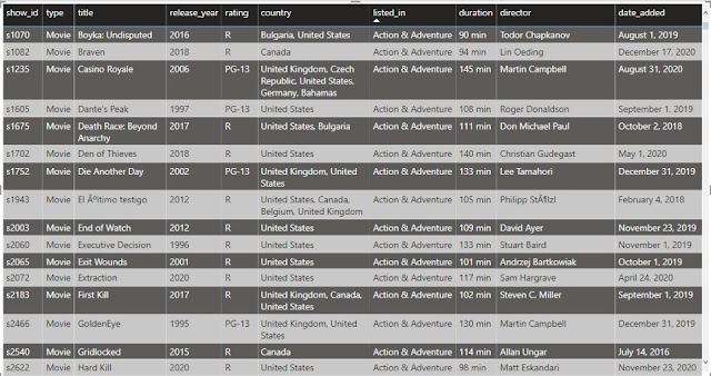 |
| Netflix Data Overview |
Let’s Move forward and start with visualizing the data and getting some insights about the data.
Firstly, let's see the number of shows based on the type present with us.
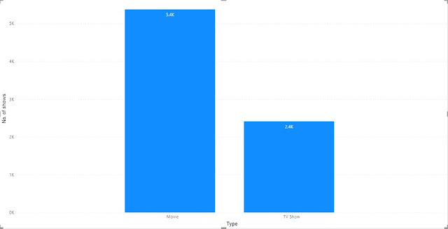 |
| Number of shows based on types |
From the above graph, we can notice we have around 5400 Movies data and 2400 TV Shows data present with us.
It indicates that No. of movies released on Netflix is higher than the No. of TV Shows released & we can say Netflix is considered more to cinema halls rather than TV sets.
Now let’s have a look at the countries producing the most No. of shows for Netflix.
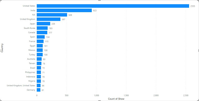 |
| Top 20 country based on total shows |
We can notice that the no. of shows originating from the USA is quite huge as compared to other countries. 2nd highest is India with around 1/3rd shows of the USA.
Also, we can see NA at 3rd position, don’t confuse it with North America, it's actually the blank values present in the dataset. i.e. we have missing country data for around 509 rows/shows. We need to handle these missing data before doing some actual analysis of this dataset.
Now let's have a look at the No. of Movies and TV Shows produced in these countries.
 |
| Top 20 country based on shows |
We can see No. of Movies from USA and India is higher than the No. of TV Shows produced in these countries whereas No. of TV Shows is higher than the No. of Movies for UK, Japan and South Korea but among these TV shows from Japan and South Korea is much higher than the Movies.
Interesting.. isn’t it..!!!
Moving on further… Let’s bifurcate the data based on Year and try to get some insights from there.
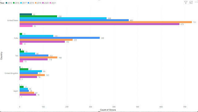 |
| Top 5 countries and shows produced in last 7 years |
The above graph shows the top 5 countries and the No. of shows produced by them each year.
Note:- I have purposely included NA in the graphs to show the impact if we directly remove these rows without properly handling the missing values.
We can see the USA produced the most No. of shows in the year 2019, and India in 2018.
Despite a lockdown in most parts of the world, we can see a high No. of shows being produced in 2020 by the USA and personal highest for Japan as compared to previous years.
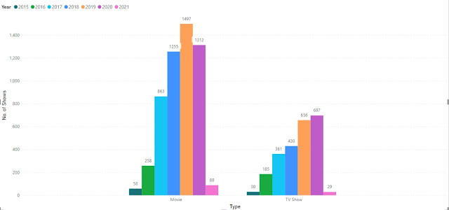 |
| No. of shows based on type in last 7 years |
The above graph is a bit similar to the previous graph, it represents the No. of shows produced in the last 7 years across all countries(including NA).
We can see there has been a continuous rise in No. of TV shows similar to movies also but there has been a downfall in 2020, which might be due to COVID-19 restrictions.
Now let’s explore a bit more on this data and see the different ratings for the shows on Netflix.
 |
| No. of shows based on rating |
We can see there are a high no. of shows under TV-MA(Mature audience only) followed by TV-14(Parents strongly cautioned), TV-PG(Parental Guidance Suggested) and R(Restricted, Children).
We can see most of the shows in the list belong to restricted and mature audiences, thus we can say that Netflix has more mature content and should be restricted for children.
We have seen countries producing the most No. of shows, so why not have a look at these shows based on ratings.
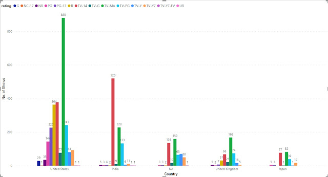 |
| No. of shows based on ratings and countries |
This graph is an enhanced version of the previous graph depicting the No. of shows produced by each country under each rating.
We can see the USA has the highest No. of TV-MA, TV-14 and R whereas India produces mostly TV-14 rating shows followed by TV-MA.
Similarly, for UK and Japan also there is high No. of TV-MA and TV-14 shows.
Let’s have a look at the ideal duration of these Netflix shows.
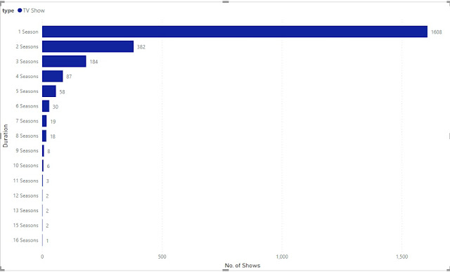 |
| Duration of TV Shows |
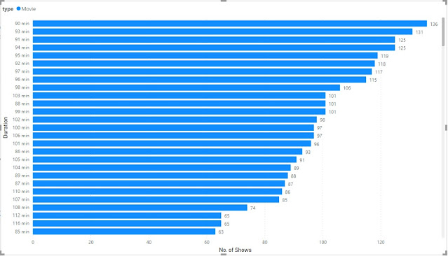 |
| Duration of Movies |
I have divided the graph into 2 separate graphs for TV Shows and Movies for better clarity.
For TV Shows we can see the most preferred duration is of 1 season(contains various episodes) whereas for Movies, looking at graph(Fig 11b) we can say it is ~90–100 mins.
 |
| Shortest Movies |
We can see we have few movies as short as 8–9 mins.
Note:- We need to verify these data for correctness.It may be due to some error at time of data collection.
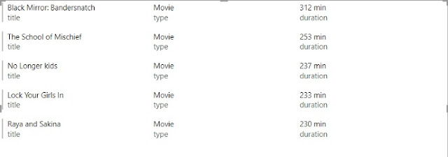 |
| Longest Movies |
The Longest movie on the Netflix is about 312 min long followed by 253 min long movie, hope so content of it is good enough to keep the person glued. 😉
Would be great to read your reviews about any of these movies… Do Share them…
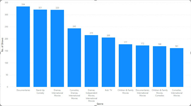 |
| Movies based on Genre |
The above graph shows the top 10 categories of the shows being hosted on Netflix.
Interestingly we can notice that Documentaries is the highest category and if we recall from above we had TV-MA and TV-14 as the highest rating for shows.
That’s all from this Netflix Dataset, Please comment down below for getting the dataset.
I Hope you liked the article, please like, share and leave a comment about your views, points for improvement Or anything specific you would like me to analyze for you.
Always Happy to Help.
Thank A lot Guys… See You soon with some more interesting analysis…
Happy Learning… !!! 🙂

Good explanation
ReplyDeleteThanks... If you want we can visualize any data for you... Do let us know to find interesting insights for your data.
DeleteNice One for Beginners to learn
ReplyDeletePython Training in Noida
Machine Learning Training in Noida
Summer Training in Noida
Data Science Training in Noida
Digital Marketing Training in Noida
Best Online Training Company
Best Online Internship Training Company
Best Online Python Training Company
Best Online Data Science Training Company
Best Online Machine Learning Training Company
Best Online Digital Marketing Training Company
how do I get this data set ?
ReplyDeleteHi, Please mail us at quickdatascienceds@gmail.com we will mail it to you.
Delete